Component: Component Label (Simulation)
| Author | Matrix Ltd. |
| Version | 1.2 (Release) |
| Category | Simulation |
Contents
 Component Label component
Add a label to a component by including this component as a sub-component. The label will always face the viewer and move with its parent object. Text for the label is automatically read from the host component's name or any chosen property.
Examples
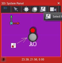
Example showing how to use the Auto Label component to display the connections, channels and any other property value of a single component on the panel.
component_label1 is setup to show the property with the name "pin" of the selected switch component.
![]() ComponentLabel
ComponentLabel

Downloadable macro reference
This component does not contain any downloadable macros
Simulation macro reference
SetTargets
Set the objects used to determine the label text and position.
Parameters
- HANDLE TextObject
- Object that will provide the label text from its name or a property.
- HANDLE BoundsObject
- Object that will set the label position and bounding box.
Return value
- This call does not return a value
ShowProperty
Sets the label to show a named property of the target object.
Parameters
- STRING Property
- Name of the property to show.
Return value
- This call does not return a value
SetPosition
Set where the label will appear relative to the object.
Parameters
- BYTE Position
- Set the position - choose a preset from the list of constants, or 'Position XYZ to enter values below.
- FLOAT X
- X axis offset (only if 'Position_XYZ' selected for 'Position')
- FLOAT Y
- Y axis offset (only if 'Position_XYZ' selected for 'Position')
- FLOAT Z
- Z axis offset (only if 'Position_XYZ' selected for 'Position')
Return value
- This call does not return a value
Hide
Hides the label.
Parameters
- This macro has no parameters
Return value
- This call does not return a value
SetColor
Sets the color of the label using a single ULONG value - such as returned by
panel GetColor functions.
Parameters
- ULONG Color
- Color to set the labels to.
Return value
- This call does not return a value
SetColorRGB
Set the label color using separate red, green and blue color channels.
Parameters
- BYTE Red
- Color parameter
- BYTE Green
- Color parameter
- BYTE Blue
- Color parameter
Return value
- This call does not return a value
Update
Refresh the label after a change.
Parameters
- This macro has no parameters
Return value
- This call does not return a value
ShowName
Sets the label to show the target object's name
Parameters
- This macro has no parameters
Return value
- This call does not return a value
Property reference
Show
This property is of type Fixed list of ints and can be referenced with the variable name show_label.
Decide what label to show...
None - no labels are displayed
Name - shows the component's name
Property - shows a property value of the component (a field for the property name will appear below)
Label target
This property is of type Panel object and can be referenced with the variable name label_target.
Set the object from which the label text will be taken.
If none is given, defaults to the parent of the label component.
Bounds target
This property is of type Panel object and can be referenced with the variable name bounds_target.
Set the object used to set the dimensions used for the positioning of the labels.
If none is given, defaults to the parent of the label component.
Auto Update
This property is of type True or false and can be referenced with the variable name label_auto_update.
Automatically update the label whenever the target's name or labelled property changes.
Use this sparingly, as it requires the component to regularly poll the component for changes!!
Color
This property is of type Color picker and can be referenced with the variable name label_color.
Color of the label text.
Background
This property is of type Color picker with transparency and can be referenced with the variable name label_bg_color.
Color for label backgroiunds - may be transparent.
Always On Top
This property is of type True or false and can be referenced with the variable name label_on_top.
Whether labels should always be draw on top of other objects.
Scale
This property is of type Floating point and can be referenced with the variable name label_scale.
Sets the basic size (text height) of the labels.
Follow Zoom
This property is of type True or false and can be referenced with the variable name label_auto_scale.
Whether labels get bigger and smaller when the panel is zoomed in and out.
Auto
This property is of type Fixed list of ints and can be referenced with the variable name label_position.
Attempt to automatically move the label to the side of the object. Choose a positive or negative offset in
any of the three axes. When 'off', the manual offsett values can be edited below.